Thursday, May 29, 2014

Software localization

Making local versions of a software requires to adapt both the language and the culture of a particular market. Most people would not care that the software they are using have been developed in Finland or in Japan but they would expect a software that gives them the impression as if it was developed not only in their native tongue but also in their own culture.

Let's imagine an educational software for children where a young character drinks a lot of coffee. While many parents in Brazil might find that behavior absolutely natural, most parents in the United States probably will not. Thus if you want to sell your localized product in the US market, you might want to replace the coffee with some kind of soft drink. However, in a localized version for the European market, soft drinks might not be the best choice either, since many European parents consider coffee and soft drinks to be equally unhealthy for their children. Likewise, avoiding sensitive geopolitical issues is another important consideration to make sure a software is well received in the international market.

Obviously, localization includes a lot of translation: text, menus, dialog boxes, buttons, wizards, online help, etc. However, beyond merely translating the language, we should also consider that currency, address, number, and date formats need to be changed as well. Besides, for many Asian languages the fonts and the font size have to be changed and Arabic or Hebrew require right-to-left layout of not only the text, but of the whole user interface. As a result, localizing a software requires to support culture-aware features right from the start. 

A localization strategy that is well planned and executed will improve the success of a localization project. The initial software specifications should consider localization as part of the product cycle. 

Delaying localization to the end of the cycle can delay the shipping date because of any unexpected localization problems that require code changes. It will also increase the cost of the project as the defects will be more difficult to correct later on.

Saturday, May 17, 2014

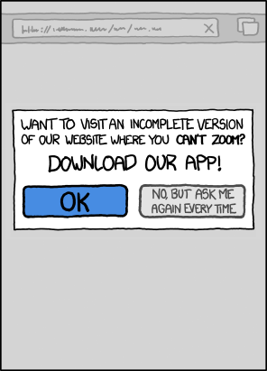
Mobile app vs. mobile website

Source: xkcd.com
In 2014, people are spending more time on internet through mobile devices than desktop computers. Most companies have understood this and try to establish a mobile presence for their business or organization. However, navigating the options for going mobile can be tricky. Deciding between a mobile application and a mobile website is a difficult choice to make since both options present advantages and disadvantages.

The obvious solution to this dilemma would be to create both in order to capture the attention of the entire mobile audience. Nevertheless, few companies can afford to build both options and that's why it is important to discover which one is the most suitable.


Advantages of a mobile website

  • More affordable: Developing a mobile website is considerably less costly than developing a native application, especially if you want to be present on different platforms (iOS, Android,...).
  • Better visibility on search engines: Mobile websites are as easy to find as regular websites because their pages can be displayed in search results. Native apps cannot be crawled by search engines and their visibility is dependent of app stores.
  • No need for approval: Creating a mobile website does not require to follow extensive guidelines nor to wait for the approval of an app store that can take from a week to several months.
  • Better flexibility to update: Changing the design or content of a mobile website simply requires to publish the edit once and the changes are immediately visible. On the other hand, updating an app requires to go through the same approval process and users need to download the update.
  • More accessible: A single mobile website can reach users across many different types of mobile devices. Its capability to reach users is far greater than a native app.

Advantages of a mobile application

  • Can use smartphone functionality: A native app is the best option if you need to access a user's camera, GPS or any other phone functions.
  • Better personalization: Since a native mobile application is always tied directly to a user's device, it creates more opportunities to offer a personalized user experience.
  • Handle a complex UI better: Native apps provide the most tailored user experience. In particular, it's almost always the best choice for interactive games.
  • No connection required: Only an app can provide an offline access to content and perform functions without a network/wireless connection.
  • Easier to monetize content: With an app, it’s particularly easy for users to make a purchase with pre-entered credit card information. An app is the best suited for offering micro-purchases for products or services like buying virtual goods or access to additional content.

Generally speaking, a mobile website should be considered the first step in developing a mobile web presence. Most programmers can handle the technologies behind it and the cost difference between the two options is pretty compelling. I think that a native mobile application is the right option only for a very specific purpose that cannot be effectively accomplished via a web browser.

Friday, May 9, 2014

The reasons behind Clippy’s massive failure

Users do not like to feel trapped by their computer. This aspect makes user control one of the most important interaction design guidelines and Microsoft learned this lesson the hard way with their Office Assistant debacle.

In the 90s, Microsoft decided to improve human computer interaction using sophisticated mathematical methods. The company's objective was to provide valuable assistance and feedback to users when necessary. This desire was materialized for the first time in Microsoft Office 97 by introducing an animated character that would guide users while they use Word and Excel. The default version of this interactive character was a talking paperclip named Clippy.


Unfortunately, Clippy worked so poorly - by trying to help when no help was needed - that it was not long before users started complaining about its behavior. For example, if you typed "Dear X" in Word, Clippy would pop up out of nowhere and say "It looks like you're writing a letter. Would you like help?".


Many users felt Clippy was a very annoying nuisance which hampered their experience of the office tool by continuously disrupting their workflow. This point of view was so widely spread that it was the subject in 2003 of a Stanford student thesis entitled Why people hate the paperclip: labels, appearance, behavior and social responses to user interface agents. A major fault that the tool had was that that it could not reason about user competence. An experienced user, who would find the tool useless, could not be differentiated from a novice user for whom the tool could be necessary. According to the blog Robotics Zeitgeist, this user differentiation feature existed but was excluded of the product release because of a lack of disk space.

Eventually Microsoft understood that their little animated character has been despised globally that they themselves started to tease him. Microsoft turned off Clippy by default with the release of Office XP on 2001 and the Office Assistant was completely removed in Office 2007.

In 2010, Time magazine declared Clippy one of the 50 worst inventions of all time. More recently, Clippy made the buzz by opening a Twitter account where he called out Satya Nadella, the recently promoted CEO of Microsoft Corporation :

Wednesday, March 26, 2014

Interest of navigation maps for web development

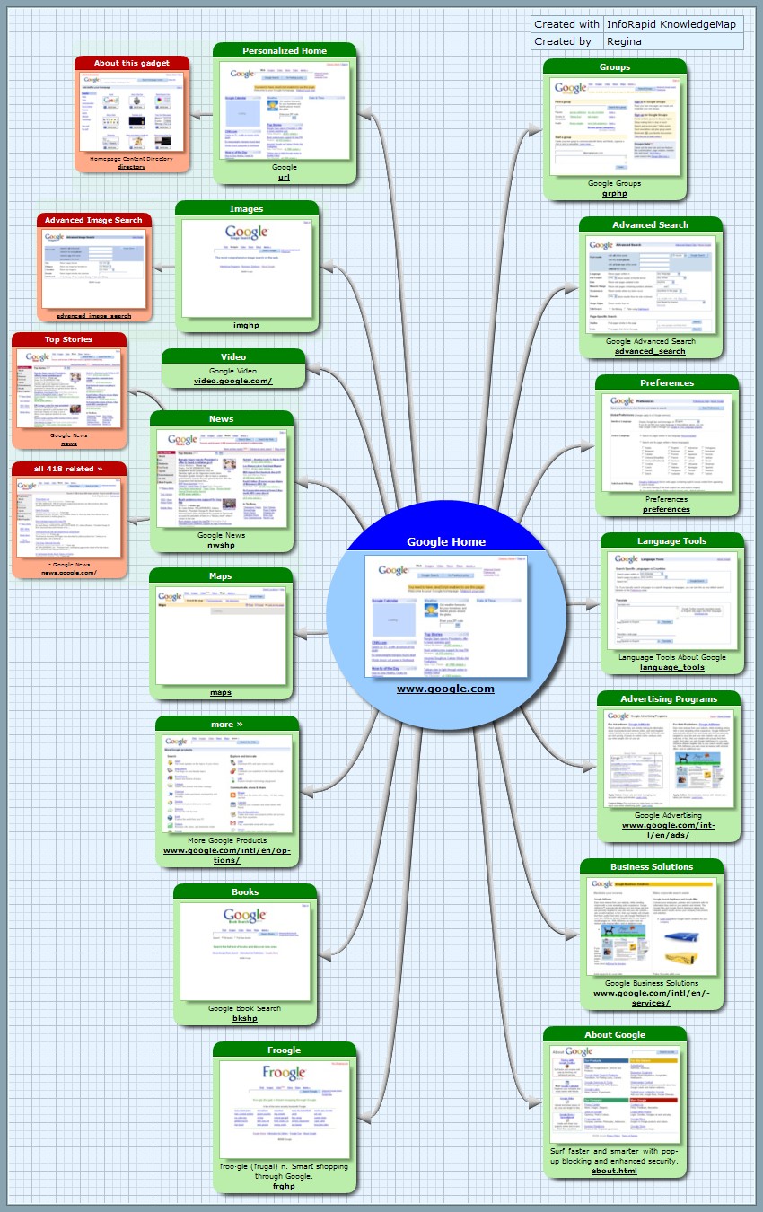
A navigation map is a planning tool in interaction design to visualize the structure of an application. This technique can be applied for any kind of applications but navigation maps are most widely used in web development and are called site maps.

Site map of Google

Apart from being a great way to visualize the content and interactions between different screens, the reason site maps are popular in web development is that it's an easy way for webmasters to inform search engines about pages on their sites that are available for crawling.

What's crawling?

Web crawling is a method for collecting data on the current state of the web. A vast number of web pages are continually being added every day and information is constantly changing. A web crawler is a way for the search engines like Google or Yahoo to regularly ensure that their databases are up-to-date for the purpose of web indexing.

To ease the process of web indexing for developers, Google introduced the Sitemaps protocol in 2005.
"Web crawlers usually discover pages from links within the site and from other sites. Sitemaps supplement this data to allow crawlers that support Sitemaps to pick up all URLs in the Sitemap and learn about those URLs using the associated metadata. Using the Sitemap protocol does not guarantee that web pages are included in search engines, but provides hints for web crawlers to do a better job of crawling your site." - sitemaps.org

Why is it essential?

One important goal of most companies is to promote and bring more visitors to their website. And to do so, they need to increase their visibility in search results. This process is called Search Engine Optimization and is a primary concern for Internet marketing.

To conclude, from a tool to detail interaction design, navigation map became a way of increasing websites visibility. Thus, the practice of this technique is more than welcome in web development for its wide range of interesting properties.

Sunday, March 2, 2014

Design: a focus on mental models

According to Don Norman in The Design of Everyday Things (1988), design is a "combination of aesthetics, economics, usability and manufacturability". Therefore, a good design must have a good level of usability, namely effectiveness, efficiency and user satisfaction. To achieve these characteristics, a product needs to be easy to use and easy to learn. That's why it is interesting to focus on mental models when designing a product.

A mental model is an explanation of someone's thought process about how something works in the real world. Don Norman describes mental models in the book Mental Models (1983) as follows:
"In interacting with the environment, with others, and with the artifacts of technology, people form internal, mental models of themselves and of the things with which they are interacting. These models provide predictive and explanatory power for understanding the interaction."
Mental models help a person interact with the world. For example, my mental model of how a bicycle works tells me that this product below won't work.

Bad design of a tandem bicycle

In Mental Models, Don Norman defined the properties of mental models.
"They can be contradictory, incomplete, superstitious, erroneous, and unstable, varying in time. So the job of system designers is to help users form an accurate and useful mental model of a system."
Even if mental models are usually not accurate representations of a phenomenon and they typically contain errors and contradictions, the good thing is that they are constantly evolving as people experience this phenomenon.

Designers "talk" to users through the User Interface of the software, materializing his own mental model. Users compare the UI with their own mental model and adjust it while using the system.

Nevertheless, it is important to design a product which will match quickly users' mental model. In software design, an user interface should be consistent with what people expect from the software. If not, users will have an inaccurate mental model that will leads to errors and misunderstanding of the system. In a perfect world, users are able to use softwares without having to modify the way they usually work. Besides, with an increased and worldwide usage of softwares nowadays, users are more and more heterogeneous and not necessarily used to technology.

By designing a system that fits people's natural mental model, software designers decrease the time needed for a user to learn how to use it leading to a better user satisfaction and - even better - less pages of documentation required.

To conclude, we can notice that creating a good design requires much more than only technical expertise. A good designer is someone aware of the impact of cognitive science on his field because a product - whatever it is - is meant to be used by humans.

Sunday, February 23, 2014

Analysis of Bryant's paper "Metaphor, myth and mimicry: The bases of software engineering"

In his paper, Antony Bryant warns us about the pitfalls around the use of the term software engineering. Even if the idea of founding our discipline on a set of rigorous and scientific rules seems reasonable, it might not have been in our best interest to give in to the urge of being considered as pure engineers.

As a matter of fact, using metaphors and specific terms has an effect on the human mind. The danger of assuming that creating software is a full engineering process lies on the tendency to mimic the engineers of other fields without taking into account the specific features of software conception. Therefore, it brings - conscientiously or not - some unwanted constraints.

The main issue is about requirements elicitation which is often considered as the most critical phase of software engineering. Indeed, applying a systematic and formal process to specify the requirements of stakeholders is very tempting but inadequate to be getting truly close to those requirements. To illustrate his point, Bryant mention the conduit metaphor and the toolmakers paradigm which both underline the way human communication works and lead to the conclusion that obtaining requirements needs essentially communication and emphatic skills.

I think the most interesting thing we should retain from Bryant's paper is that a good software engineer has to keep an open-mind and not lock himself in a pure engineered vision of his discipline. Elaborating a software is a task which requires human interactions and not solely logical processes.